The name of Hermann Zapf, the Wizard of Fonts and permanent honorary member of the Board of TUG, is well known in our community. This small book describes his life and work, and is a very welcome addition to the Wizard’s Alphabet Stories, which was reviewed by Hans Hagen and Taco Hoekwater in 2007 (TUGboat 28:2, p. 174). The book is written by Jerry Kelly, and, like Kelly’s other books, has a very interesting text accompanied by well-chosen illustrations.
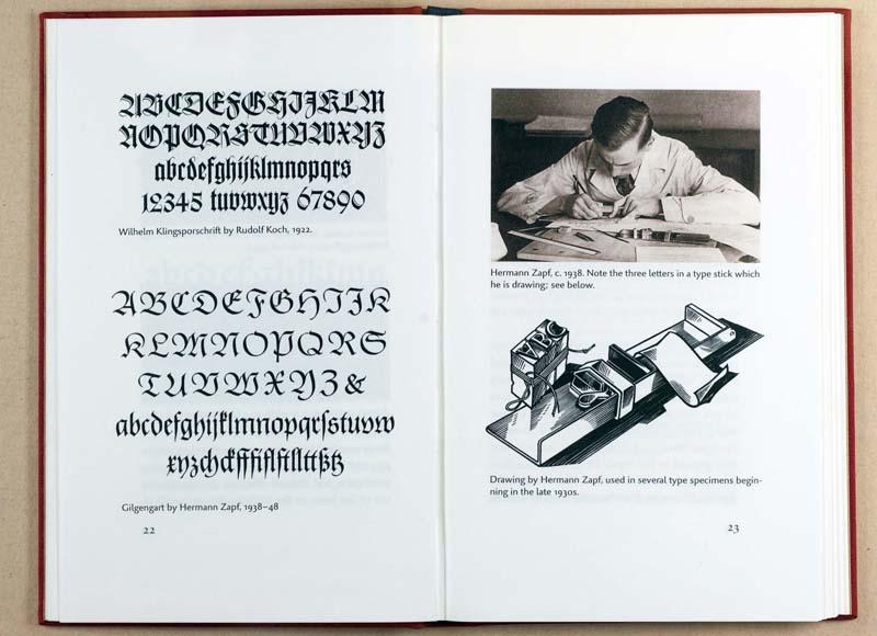
Kelly divides Zapf’s work into three periods: the early period during the metal type era, the middle period, when new technologies like photocomposition were dominating, and the later period when digital technologies became ubiquitous. For each period Kelly selects Zapf’s fonts that best show the evolution of the master, from the early but already elegant Gilgengart to the breathtaking in its innovation and beauty Zapfino. The examples are meticulously chosen and illustrate the main qualities of Zapf’s talent: the deep understanding of technology, the attention to details and the striving for perfection.
Usually the font design field tends to be conservative (after all we call the fonts designed in the late 18th century ‘Modern’). The more amazing is the way Hermann Zapf has always been open to new ideas. He saw the growth of the major typographic technologies of the last and current centuries, and actively participated in it, contributing ideas that shaped the industry. Kelly shows examples of this throughout Zapf’s career.
A TeX user would be interested in the parts of the book describing Zapf’s work with DEK on Euler fonts and his contributions to the typesetting algorithms (some of them are implemented in the modern TeX engines).
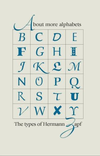
About more alphabets is beautifully illustrated and accompanied by type specimens of more than two dozen of Zapf’s fonts. It is well typeset in Comenius, a great and rare font (of course, designed by Zapf). There are a thousand copies of this book printed, plus seventy-five additional copies specially bound and signed by the author. I am sure each copy of both editions will become a prized rarity.
The book has a well-written foreword by another great figure of modern typography, Robert Bringhurst. It is noted there, “We evidently think (in defiance of all logic) that what we read or write matters far more than how it’s read or written, and that letterforms are just a way to get there, as a door knob is a way to open a door. At their best, though, letterforms are more like sailboats and cellos. They are works of art that beg to be used as well as admired.” These words, like the sound of a tuning fork, set the tone of the book. About more alphabets is a fitting tribute to the art of letterforms and to its master, Hermann Zapf. I must note that the book itself is a piece of art, splendidly produced by Jerry Kelly. I would recommend it to anybody interested in letterforms, typography and book design—or just being able to appreciate and enjoy beautiful books.