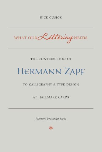
What Our Lettering Needs by Rick Cusick (with a foreword by Sumner Stone) covers a deceptively narrow topic which would at first glance seem too specific to warrant even this slim, elegant volume. Instead, it addresses a lacuna which has haunted books on graphic design and typography for years—the one line showings of proprietary Hallmark typeface designs which represent the iceberg-like tip of seven years of work by Prof. Hermann Zapf at Hallmark (1966–1973, pg. 95).
While such Flying Dutchman-like showings are too many to count, there is also a certain difficulty in enumerating the typefaces themselves due to the passage of time, the combination of one design with another to constitute a third and confused naming (pg. 38). There are all-too-brief samples shown on the two-page spread in the 2001 Zapfest exhibition catalog Calligraphic Type Design in the Digital Age: An Exhibition in Honor of the Contributions of Hermann and Gudrun Zapf (pgs. 26 and 27), the author’s article which was the precursor to this work.
In this new book, a page or two, or more, is devoted to a dozen of these designs (an informal script, Jeannette; the contemporary Chancery Italic, Firenze; Hallmark Uncial; Hallmark Textura; the text face Crown Roman; an upright calligraphic font with civilité characteristics, Missouri; the unconnected script Scriptura; a calligraphic sans, Shakespeare, by Gudrun Zapf von Hesse; the combinatorial Stratford, Charlemagne, and Winchester; as well as Constanze, a script alphabet designed by Joachim Romann), showing not just the finished alphabets, but also initial studies as well as examples of usage of the typefaces. None of these, however, are among the 87 typefaces which Hallmark has licensed to Monotype Imaging (http://www.fonts.com/findfonts/searchresults.htm?kid=hallmark). Readers however should be certain to compare the pages on Crown Roman with the book Hunt Roman: The Birth of a Type by Hermann Zapf and Jack Werner Stauffacher (available online at http://posner.library.cmu.edu/Posner/books/book.cgi?call=744.2_Z35H).
Just as important as the typeface designs is the coverage of some of the technical details of Prof. Zapf’s design work, including the “clip and tip” where a swash is drawn on one sheet of paper and then cut out and attached to a letterform in the layout, and many pages from The Hallmark Lettering Instruction Book (or The Manual as it was called—an entire chapter is devoted to it) are shown in full color as are all the photographs and illustrations. Some such details are very humbling, such as the exquisitely beautiful design study for Zapfino-like capitals intended for use with Firenze shown with the 49-cent Deluxe Fine Point Bic ballpoint pen used to render the letters (pg. 43).
The chronography covers a time in which technology was rapidly changing and the breadth of material covered in each chapter reflects this, making it a wonderful introduction to what design work used to be like. More importantly, the cast of characters reads like a “Who’s Who” of the design world, making the book a wonderful vade mecum for the designer who needs suggestions on what to read next (be sure to consult the Sources on pg. 109). The book’s usefulness as research material is aided by having an index (presumably prepared by Molly Cort, who is credited with “Editorial and Production” in the book’s colophon). It stands alone as a reference on the gift book line, Hallmark Editions, and also has a fascinating appendix on The Crabgrass Press and Phil Metzger.
The book has a few shortcomings—too small to show at actual size the larger originals (the pages from The Manual especially suffer from this); too short to show all the typefaces in the same detail as the dozen which were featured; some typographic infelicities such as allowing the last word on a page to break (e.g.,“nevertheless” from the bottom of pg. 72 to the top of pg. 75); allowing as many as three hyphens in a row; and some odd choices in the formatting, e.g., the usage of a single master page for the page design for much of the book, one with the marginal notes column on the left and the page’s folio on the right, which leaves us with the uncomfortable feeling of all compromises.
Nevertheless, all puns aside, this book is what every graphic designer, typographer and calligrapher needs.